by Dan | Jan 17, 2012 | 3D Graphics, Graphic Visualization
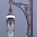
 A clock tower interior. I saw an episode of Selling New York on HGTV and was inspired to create my own apartment. This is the early work. It’s Penn Station meets Art Nouveau with a dash of Art Deco. As you can see I still have a habit of putting in ALL the detail. 45,276,536 polygons. All the rivets are there. The lightbulbs have glassblower points. I still need to put the catwalks in. And of course the walls and clocks.
by Dan | Jan 17, 2012 | 3D Graphics, Graphic Design, Graphic Visualization
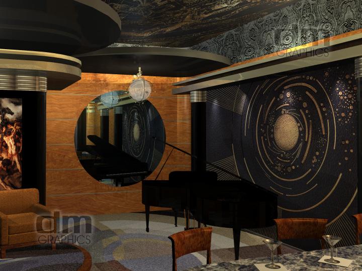
 Art Deco. Not it’s original name. At the time it was called Art Moderne, from the French. It embodied the ultimate expression of industrial design. Cars, homes, paintings, posters, toasters all aquired it. It was and is, in my opinion, the best of modern design. All styles that follow owe themselves to it. Mid-century modern, sixties mod and even the seventies drew upon it. Obviously, as time went on it became more and more “cartoonish”. The seventies were the biggest abuser of the style, but they tried, so maybe they can be forgiven (a little bit). The style was really all about speed, manufacturability, and materials. The best was always used in materials when possible as well as the most new and up-to-date technologies (sound familiar, eh?). But today the materials seem to be less important. Elegance and sophistication were the thing. It’s still here, sometimes, and should be used and appreciated more but without cartooning it or what I would rather say “Disney-fying” it. It’s based on classisim and now seems to be released from that and made overblown and out of proportion. It should be fun and elegantly welcoming. I’ve posted here a lounge I designed. Tell me your comments….

by Dan | Dec 9, 2011 | 3D Graphics, Graphic Visualization, Personal Thought, Shared Idea
I’m up a bit late for me. But a song came into my head (“What’ll I Do?” Irving Berlin 1924), and it made me wonder. What would people do if we lost the places we remember and didn’t try to keep. I know preservation has been a pretty big thing since the 70’s, but does anybody really try to do something? Sure they will if it’s connected to someone famous. But what about the commonplace places? The places we take for granted, you don’t notice until they’re gone. They had a place and purpose. Folks walked through, ate, greeted, said good-by, created new lives and lost others. But to others they’re just crap. Should be torn down, discarded, tossed off like an old tissue. Have you ever thought about those who have been there? Celebrated a birthday, asked her to marry you, was told he was killed in the war or sent him off to the war to fight? Brought him home when he came back? And those that go off in search of the future. It’s all high hopes and it usually is. But in that place we were there to welcome them back when they needed it. And always pie as a prize or consolation. Here, I offer a few of those places. With all the dirt and grime, wear and tear that they’ve lived through. I got the best compliment about the diner. “I like it! It smells bad.” That’s because it’s had a life. Imagined, yes, but a life. Images should say that. You don’t have to have action, you just have to look closely.


by Dan | Aug 4, 2011 | 3D Graphics, Graphic Design, Graphic Visualization, Logo, Logo Design, Website Banner
I was asked to animate a logo I designed. I think it came out quite nice. The logo wasn’t chosen, but I still think it was a good shot and shows what I can do.
by Dan | Aug 1, 2011 | Business Thought, Graphic Design, Graphic Visualization, Personal Thought, Shared Idea
Recently, I was asked the ongoing question, “What color should I paint my room?” Normally, this shouldn’t be a bad question. But, I’ve discovered, many people mave a real problem picking interior colors. They end up with the proviberial “Beige”. Good in some cases, but come on show some spunk. What colors do you REALLY like? Some of this comes from outside influences and some from ethic upbringing. Here in Florida beige is king. If you’re really daring, maybe two tones of beige. With white trim, of course. This may be fine for builders and those afraid of color, but may folks seem to think that they have to follow that rule. Don’t get me wrong, beige is fine for some things, but many people would like to push out of that and try new colors. Great! They go the the paint store and find a color they like. Buy a gallon or two of said color. Paint a wall and hate the color. First problem: NEVER pick the color at the store! Pick several shades and tints around the color you like and take the samples home. Paint stores probably hate me but, I’ll walk out with dozens of chips similar to the color I think I want. I then take them home and decide from there. Big thing is that color changes according to the room light. It might have been great in the store, but once home it might not be what you thought. I suggest, take the chips into the room to be painted. Go through all of them and find the ones that still appeal to you. I like to fold the chip to color I like and tape it to the wall. This way tou see it vertically. Colors change depending on whether you look at them vertically (on the wall) or horizontally (looking at them on the counter). Do this with ALL the colors you still seem to like. Walk away for a while (15 minutes is good). Go back and see what you still like. Pull down the ones that don’t quite work anymore. Something I was told MANY years ago was that whatever color you like for a wall, take and grey them a bit. Remember, your looking at a tiny spot of the color. Once you paint the wall that really nice red, you’ll end up feeling like your in a stop sign. Really stong colors are best for accents. And so if you dim them down (usually by lightening them and maybe not using them for a whole room) you’ll find that they look much better. For the wall, really dim them. Colors on walls get stronger once multiplied over a larger surface. My friend wanted her bathroom to be orange. Not my most favorite color, but she really likes orange. Instead of saying go with a lighter color like peach, I suggested a more terracotta type of color. This after she had already painted the room primary orange. We came up with a slightly darker, washed out terracotta that she thought she was going to hate from the small sample. Once on the wall, it multiplied to a rich, warm orangeish tone that she really liked afterall.
Something else. Don’t be afraid to use a darkish color in a small room. I depends on the lighting. A bathroom with bright light and white walls is too bright. Try a deeper color, I’ve done beige (but a more coffee color), red (but washed down to a rich terracotta/pink) and a denim blue. None of which had white trim.
If your going with color, use color on the trim. Example, the beige bathroom has slightly lighter beige trim (the cabinets were off-white). Safe, yes. The red bath has natural oak trim and cream/terracotta/pale moss green accents. With the remaining trim a warm grey and an off-white tile floor. The denim bath is more daring when first thought about. It has denim blue walls, off-white tile and floor, but the ceiling is metallic silver as is the trim. Silver can be used as a neutral because it picks up the tone of the colors around it. The door was painted a very deep, rich royal purpleish blue. Very strong, but it’s just the door.
The ethnic choice of colors is a problem for many. Don’t use the main, primary, color. Ethnic yellow (French’s mustard yellow) or other strong yellows are popular, but painfull to live with. Dim or wash it out. The color most likely will be very overwhelming if you don’t back off from it a bit. Not to say, don’t use those colors. They make you happy. Just back off a bit on the strength and use them as accent walls or use an accent wall to relieve the strength from the primary color. Example: a soft blue room, jazzed up with a rich terracotta accent wall.
Don’t just figure white is the only color for trim. There are many others choices. In fact, if you do go with a deep color for the walls, don’t use white trim. It stands out too much and with give you a caged in feeling.
That’s all I have to say at the moment. Ask me your questions. I’m more than happy to help.


 A clock tower interior. I saw an episode of Selling New York on HGTV and was inspired to create my own apartment. This is the early work. It’s Penn Station meets Art Nouveau with a dash of Art Deco. As you can see I still have a habit of putting in ALL the detail. 45,276,536 polygons. All the rivets are there. The lightbulbs have glassblower points. I still need to put the catwalks in. And of course the walls and clocks.


Recent Comments