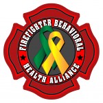
by Dan | Aug 30, 2011 | Graphic Design, Graphic Visualization, Logo, Logo Design
Just completed a new logo. This one for the Firefighters Behavioral Health Alliance. A group for suicide prevention. Firefighters are dear to my heart, so doing something like this for them is quite the honor for me. I hope I get more.

by Dan | Aug 4, 2011 | 3D Graphics, Graphic Design, Graphic Visualization, Logo, Logo Design, Website Banner
I was asked to animate a logo I designed. I think it came out quite nice. The logo wasn’t chosen, but I still think it was a good shot and shows what I can do.
by Dan | Jun 27, 2011 | Business Thought, Graphic Design, Graphic Visualization, Logo, Logo Design, Personal Thought, Shared Idea
I’ve been seeing a great number of business cards lately. Frankly, I think people should think a bit harder about what kind of image they promote. Consider this…
First off: Your business name is very important. It needs to convey what you do and your dynamic. Are you a body shop and a computer resource company? A good strong name can make or break you.
Second: Your image. You now have a great name. Now you must project that name with an image that fits what you do. Unless you’re an elementary school, type in multiple colors says you are. I see that too many times being told that the colors draw attention. Great, if you’re a family looking for a happy place for your child. If you’re a speed shop, your type should reflect that. High tech? Look that way. Your name in the right type conveys it’s power. Even if this card is just a calling card with you personal name and contact information, it needs to reflect in it’s typography, who you are.
Third: Graphics. You normally don’t need a complicated graphic to get your point across. This will become your logo. Remember, the cleaner and straight to the point your logo is, the more memorable it becomes. Especially, if you keep a consistant overall use. Consider, Levi’s. Not only has it built a fantastic image because of product quality, but because it uses it’s image over and over. To the point that it doesn’t really need the type to tell you who they are. Now Verizon has made it’s name/logo one piece. This also works, it’s used constantly. To the point that they could almost lose the type and just use the “V” and “z”. This also points out that, on occasion, two colors work. The red “V” and “z” could stand alone and you could easily tell who it is. This could go on forever… Just remember that the graphic and logotype are your attention grabber. You tell a good portion of what you do and who you are right off the bat. Showing the wrong image will instantly kill your credibility.
Business Cards and Letterhead: OK, you’ve got a terrific logo, name and business. Let’s look at your business card.
There is a hierarchy of what should be placed on the card.
Don’t put too much! You need to have your name (most important), your title (next) and then contact information.
Example:
dmGraphics (logo art)
Daniel Mauk (largest type)
Graphic Designer (somewhat smaller)
813-541-5881 (a tiny bit smaller yet)
dmGraphicsDesigner.com (same small size. Pretty much the same as the phone number)
These are the most important parts of a business card.
These principals also are appropriate for calling cards (you without a business link). Think of it as a way to have people remember you. Say you’re out in a group of people. You’ve been chatting up someone and they seem interested in you and what you do. Give them a your card. Then they don’t have to try to remember the complete conversation (which is nearly impossible). They’ll remember your name, see what you do and have your contact info. That’s what’s most important. After that, it’s nice to have some sort of catch line (mine, as you’ve seen, is “Creativity Without Boundaries”). It’s just like a television ad. It fills in what you are and should stick in your head. If you have a lot of other info you need to list, consider a two sided card. On the back you can list (short list, bullet points are best) and repeat the contact info. If you’re a business with several employees, get cards of all the same design with the names and contact info changed to fit. It continues to build continuity and credibility.
Letterhead: Granted, this is just the paper you send letters on. Don’t underestimate it’s power. It continues your image and builds further credibility. All companies have letterhead. You can use it for correspondence or billing invoices. I recommend, though, having a separate billing form. It stands out and won’t be as easily overlooked when mixed in with letters.
All this gives you the chance to give the right impression the first time. That’s all you have. You are trying to be memorable and have the folks you talk to feel that you know what you’re doing and do it very well. Remember that your discussion is just as important as your card. It gives you the chance to have them like you. Then they’ll call. These are bits of paper. But they are bit’s of paper with a lot of power.
Think about it.
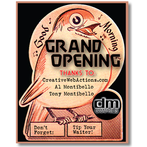
by Dan | Jun 2, 2011 | Graphic Design, Graphic Visualization, Logo, Logo Design, Personal Thought
Welcome to the new dmGraphics Designer website. I’m truely excited and proud to have a chance to show off my work. And, hopefully, drum up opportunities to do some work for others.
I do need to express my thanks to CreativeWebActions Al and Tony Montibello for everything.
Also, big thanks to: John, Owen and Wilda, Charles and Angela and a host of others for their advice and support.
Now let’s get to work!


Recent Comments