
by Dan | Feb 1, 2012 | 3D Graphics, Graphic Visualization
As you can see not much obvious in the way of changes. I created a ladder system to get to the catwalks (with guard lights so you don’t get lost in an emergency in the dark). The catwalks (my attention to detail) have pyramid prisms in the walkway to allow light through and cast iron handrails with copper posts. And, of course, how can a grand space like I envision be without a grand chandelier. Crystal, of course.
We’re now up to 84,995,181 polygons. If I do say so myself, I think it’s a pretty nice start. What do you think?

by Dan | Jan 17, 2012 | 3D Graphics, Graphic Visualization
 A clock tower interior. I saw an episode of Selling New York on HGTV and was inspired to create my own apartment. This is the early work. It’s Penn Station meets Art Nouveau with a dash of Art Deco. As you can see I still have a habit of putting in ALL the detail. 45,276,536 polygons. All the rivets are there. The lightbulbs have glassblower points. I still need to put the catwalks in. And of course the walls and clocks.
by Dan | Jan 17, 2012 | 3D Graphics, Graphic Design, Graphic Visualization
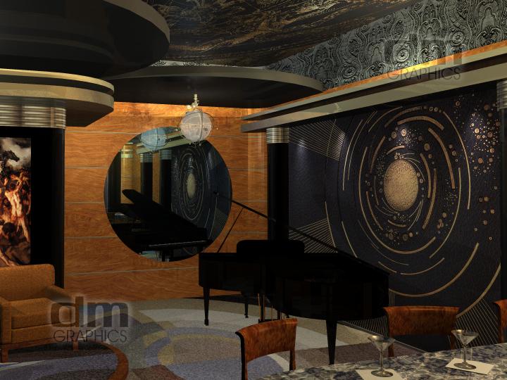
 Art Deco. Not it’s original name. At the time it was called Art Moderne, from the French. It embodied the ultimate expression of industrial design. Cars, homes, paintings, posters, toasters all aquired it. It was and is, in my opinion, the best of modern design. All styles that follow owe themselves to it. Mid-century modern, sixties mod and even the seventies drew upon it. Obviously, as time went on it became more and more “cartoonish”. The seventies were the biggest abuser of the style, but they tried, so maybe they can be forgiven (a little bit). The style was really all about speed, manufacturability, and materials. The best was always used in materials when possible as well as the most new and up-to-date technologies (sound familiar, eh?). But today the materials seem to be less important. Elegance and sophistication were the thing. It’s still here, sometimes, and should be used and appreciated more but without cartooning it or what I would rather say “Disney-fying” it. It’s based on classisim and now seems to be released from that and made overblown and out of proportion. It should be fun and elegantly welcoming. I’ve posted here a lounge I designed. Tell me your comments….

by Dan | Dec 9, 2011 | 3D Graphics, Graphic Visualization, Personal Thought, Shared Idea
I’m up a bit late for me. But a song came into my head (“What’ll I Do?” Irving Berlin 1924), and it made me wonder. What would people do if we lost the places we remember and didn’t try to keep. I know preservation has been a pretty big thing since the 70’s, but does anybody really try to do something? Sure they will if it’s connected to someone famous. But what about the commonplace places? The places we take for granted, you don’t notice until they’re gone. They had a place and purpose. Folks walked through, ate, greeted, said good-by, created new lives and lost others. But to others they’re just crap. Should be torn down, discarded, tossed off like an old tissue. Have you ever thought about those who have been there? Celebrated a birthday, asked her to marry you, was told he was killed in the war or sent him off to the war to fight? Brought him home when he came back? And those that go off in search of the future. It’s all high hopes and it usually is. But in that place we were there to welcome them back when they needed it. And always pie as a prize or consolation. Here, I offer a few of those places. With all the dirt and grime, wear and tear that they’ve lived through. I got the best compliment about the diner. “I like it! It smells bad.” That’s because it’s had a life. Imagined, yes, but a life. Images should say that. You don’t have to have action, you just have to look closely.


by Dan | Dec 7, 2011 | Graphic Design, Graphic Visualization, Personal Thought, Shared Idea
 I was asked to design custom wallpaper. Now, I’ve designed patterns for fabric many times before and found this to be just the same. It’s just an all-over, seamlessly repeating pattern. This time the subject was the New York City subway system. The map was suggested, but if you’ve ever looked at with an eye to make it repeat endlessly it would be maddening and not something one could stand looking at for long, much less live or work with. Being a major fan of the system, I was beyond thrilled to take this on. I decided to use the signage and train routing information. This gives you lots of color and something managable to work with. I designed it in two colorways. Any of you New Yorkers can check me on the listings. With the exception of dropping a few stops due to redundency, the listings are correct. And the route names are correct. In design, you have to do your research. If you don’t you’ll just make yourself and your client look bad.

by Dan | Dec 7, 2011 | 3D Graphics, Graphic Design, Graphic Visualization, Personal Thought
 I bought an old Remington Standard # 12 typewriter many years ago at a garage sale for $5.00. I used it for all my papers in college and typed my original resume on it. After that it became a cast iron brick that my dog, Louis, used to type his novel. Actually he just stepped on the keys and tried to catch the hammers, but I liked pretending he was writing a doggy tell-all. A bit back I decided I really admired it’s lines and sturdy, straight forward looks. So, I decided to create it in digital 3D. I also created appropriate letter head to finish it off. I know, this serves no real purpose, and to folks who really know typewriters the graphics aren’t right, but I plead “artistic license” (I couldn’t help myself) but does everything have to? It’s shiney. Oooooooo……….


Recent Comments