
by Dan | Dec 7, 2011 | Graphic Design, Graphic Visualization, Logo, Logo Design
Hey kids, I’m back. Haven’t blogged for quite a while. Life distracts sometimes. Here’s a logo I worked up for a possible upcoming television network. The top one is the full version and the botton (D2) is the bottom corner icon. Whatta ya think?

by Dan | Aug 30, 2011 | Graphic Design, Graphic Visualization, Logo, Logo Design
Just completed a new logo. This one for the Firefighters Behavioral Health Alliance. A group for suicide prevention. Firefighters are dear to my heart, so doing something like this for them is quite the honor for me. I hope I get more.

by Dan | Aug 4, 2011 | 3D Graphics, Graphic Design, Graphic Visualization, Logo, Logo Design, Website Banner
I was asked to animate a logo I designed. I think it came out quite nice. The logo wasn’t chosen, but I still think it was a good shot and shows what I can do.
by Dan | Aug 1, 2011 | Business Thought, Graphic Design, Graphic Visualization, Personal Thought, Shared Idea
Recently, I was asked the ongoing question, “What color should I paint my room?” Normally, this shouldn’t be a bad question. But, I’ve discovered, many people mave a real problem picking interior colors. They end up with the proviberial “Beige”. Good in some cases, but come on show some spunk. What colors do you REALLY like? Some of this comes from outside influences and some from ethic upbringing. Here in Florida beige is king. If you’re really daring, maybe two tones of beige. With white trim, of course. This may be fine for builders and those afraid of color, but may folks seem to think that they have to follow that rule. Don’t get me wrong, beige is fine for some things, but many people would like to push out of that and try new colors. Great! They go the the paint store and find a color they like. Buy a gallon or two of said color. Paint a wall and hate the color. First problem: NEVER pick the color at the store! Pick several shades and tints around the color you like and take the samples home. Paint stores probably hate me but, I’ll walk out with dozens of chips similar to the color I think I want. I then take them home and decide from there. Big thing is that color changes according to the room light. It might have been great in the store, but once home it might not be what you thought. I suggest, take the chips into the room to be painted. Go through all of them and find the ones that still appeal to you. I like to fold the chip to color I like and tape it to the wall. This way tou see it vertically. Colors change depending on whether you look at them vertically (on the wall) or horizontally (looking at them on the counter). Do this with ALL the colors you still seem to like. Walk away for a while (15 minutes is good). Go back and see what you still like. Pull down the ones that don’t quite work anymore. Something I was told MANY years ago was that whatever color you like for a wall, take and grey them a bit. Remember, your looking at a tiny spot of the color. Once you paint the wall that really nice red, you’ll end up feeling like your in a stop sign. Really stong colors are best for accents. And so if you dim them down (usually by lightening them and maybe not using them for a whole room) you’ll find that they look much better. For the wall, really dim them. Colors on walls get stronger once multiplied over a larger surface. My friend wanted her bathroom to be orange. Not my most favorite color, but she really likes orange. Instead of saying go with a lighter color like peach, I suggested a more terracotta type of color. This after she had already painted the room primary orange. We came up with a slightly darker, washed out terracotta that she thought she was going to hate from the small sample. Once on the wall, it multiplied to a rich, warm orangeish tone that she really liked afterall.
Something else. Don’t be afraid to use a darkish color in a small room. I depends on the lighting. A bathroom with bright light and white walls is too bright. Try a deeper color, I’ve done beige (but a more coffee color), red (but washed down to a rich terracotta/pink) and a denim blue. None of which had white trim.
If your going with color, use color on the trim. Example, the beige bathroom has slightly lighter beige trim (the cabinets were off-white). Safe, yes. The red bath has natural oak trim and cream/terracotta/pale moss green accents. With the remaining trim a warm grey and an off-white tile floor. The denim bath is more daring when first thought about. It has denim blue walls, off-white tile and floor, but the ceiling is metallic silver as is the trim. Silver can be used as a neutral because it picks up the tone of the colors around it. The door was painted a very deep, rich royal purpleish blue. Very strong, but it’s just the door.
The ethnic choice of colors is a problem for many. Don’t use the main, primary, color. Ethnic yellow (French’s mustard yellow) or other strong yellows are popular, but painfull to live with. Dim or wash it out. The color most likely will be very overwhelming if you don’t back off from it a bit. Not to say, don’t use those colors. They make you happy. Just back off a bit on the strength and use them as accent walls or use an accent wall to relieve the strength from the primary color. Example: a soft blue room, jazzed up with a rich terracotta accent wall.
Don’t just figure white is the only color for trim. There are many others choices. In fact, if you do go with a deep color for the walls, don’t use white trim. It stands out too much and with give you a caged in feeling.
That’s all I have to say at the moment. Ask me your questions. I’m more than happy to help.
by Dan | Jun 27, 2011 | Business Thought, Graphic Design, Graphic Visualization, Logo, Logo Design, Personal Thought, Shared Idea
I’ve been seeing a great number of business cards lately. Frankly, I think people should think a bit harder about what kind of image they promote. Consider this…
First off: Your business name is very important. It needs to convey what you do and your dynamic. Are you a body shop and a computer resource company? A good strong name can make or break you.
Second: Your image. You now have a great name. Now you must project that name with an image that fits what you do. Unless you’re an elementary school, type in multiple colors says you are. I see that too many times being told that the colors draw attention. Great, if you’re a family looking for a happy place for your child. If you’re a speed shop, your type should reflect that. High tech? Look that way. Your name in the right type conveys it’s power. Even if this card is just a calling card with you personal name and contact information, it needs to reflect in it’s typography, who you are.
Third: Graphics. You normally don’t need a complicated graphic to get your point across. This will become your logo. Remember, the cleaner and straight to the point your logo is, the more memorable it becomes. Especially, if you keep a consistant overall use. Consider, Levi’s. Not only has it built a fantastic image because of product quality, but because it uses it’s image over and over. To the point that it doesn’t really need the type to tell you who they are. Now Verizon has made it’s name/logo one piece. This also works, it’s used constantly. To the point that they could almost lose the type and just use the “V” and “z”. This also points out that, on occasion, two colors work. The red “V” and “z” could stand alone and you could easily tell who it is. This could go on forever… Just remember that the graphic and logotype are your attention grabber. You tell a good portion of what you do and who you are right off the bat. Showing the wrong image will instantly kill your credibility.
Business Cards and Letterhead: OK, you’ve got a terrific logo, name and business. Let’s look at your business card.
There is a hierarchy of what should be placed on the card.
Don’t put too much! You need to have your name (most important), your title (next) and then contact information.
Example:
dmGraphics (logo art)
Daniel Mauk (largest type)
Graphic Designer (somewhat smaller)
813-541-5881 (a tiny bit smaller yet)
dmGraphicsDesigner.com (same small size. Pretty much the same as the phone number)
These are the most important parts of a business card.
These principals also are appropriate for calling cards (you without a business link). Think of it as a way to have people remember you. Say you’re out in a group of people. You’ve been chatting up someone and they seem interested in you and what you do. Give them a your card. Then they don’t have to try to remember the complete conversation (which is nearly impossible). They’ll remember your name, see what you do and have your contact info. That’s what’s most important. After that, it’s nice to have some sort of catch line (mine, as you’ve seen, is “Creativity Without Boundaries”). It’s just like a television ad. It fills in what you are and should stick in your head. If you have a lot of other info you need to list, consider a two sided card. On the back you can list (short list, bullet points are best) and repeat the contact info. If you’re a business with several employees, get cards of all the same design with the names and contact info changed to fit. It continues to build continuity and credibility.
Letterhead: Granted, this is just the paper you send letters on. Don’t underestimate it’s power. It continues your image and builds further credibility. All companies have letterhead. You can use it for correspondence or billing invoices. I recommend, though, having a separate billing form. It stands out and won’t be as easily overlooked when mixed in with letters.
All this gives you the chance to give the right impression the first time. That’s all you have. You are trying to be memorable and have the folks you talk to feel that you know what you’re doing and do it very well. Remember that your discussion is just as important as your card. It gives you the chance to have them like you. Then they’ll call. These are bits of paper. But they are bit’s of paper with a lot of power.
Think about it.
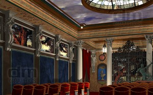
by Dan | Jun 8, 2011 | 3D Graphics, Graphic Design, Graphic Visualization
I finally decided to finish the design I started for a home theater. I hadn’t finished it because the client unfortunately died before the changes he made could be completed. I felt bad, so I didn’t finish it until recently. Really all I needed to do was show seating. I opted to put in regular theater seats instead of the planned seating for this image. Seating was to be more like a club lounge with the big recliners and side buffets and a cocktail bar. He wanted a “real, authentic theater palace” look. Reproduction Maxfield Parrish murals, custom cloud ceiling and a stained glass dome in leau of a chandelier.


Recent Comments